
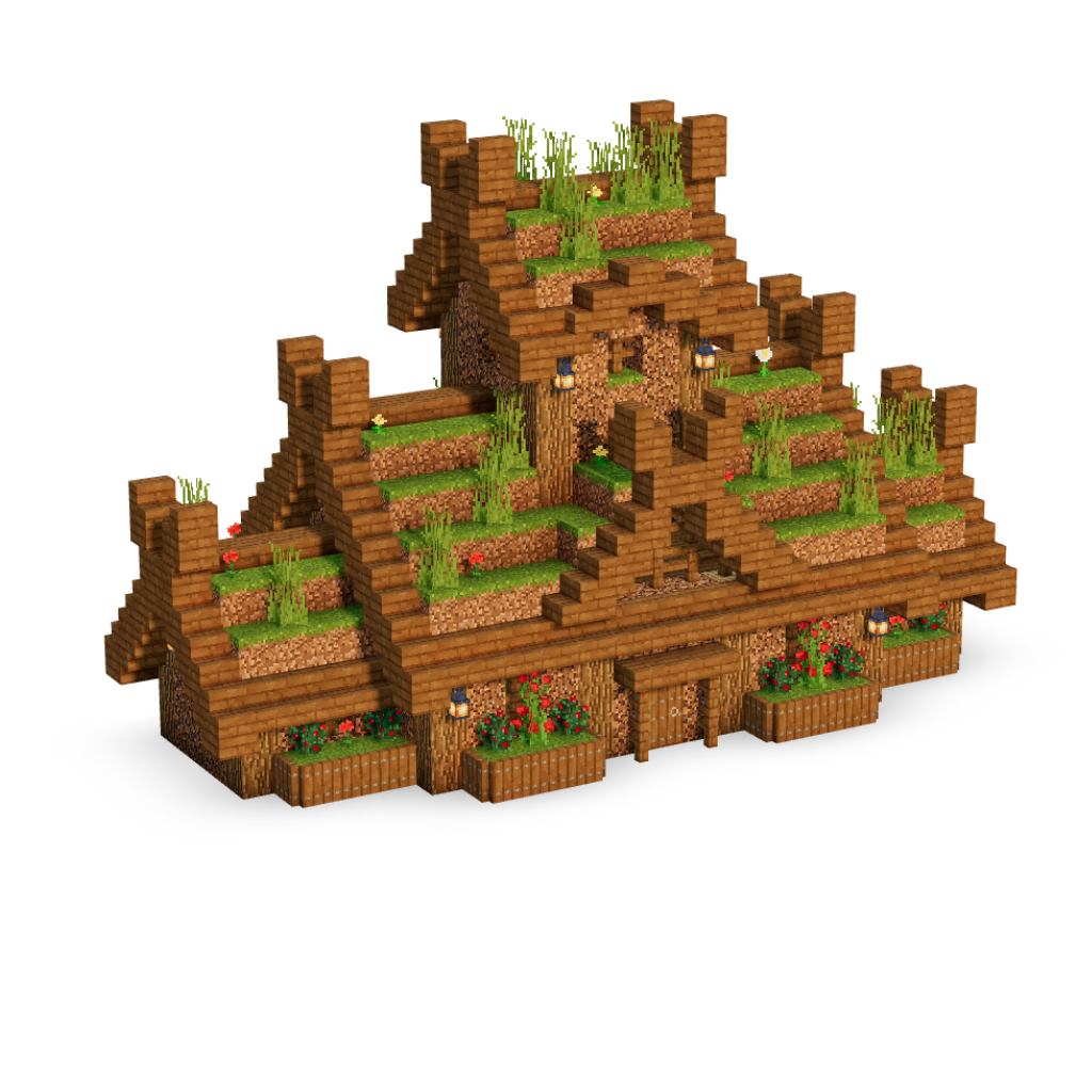
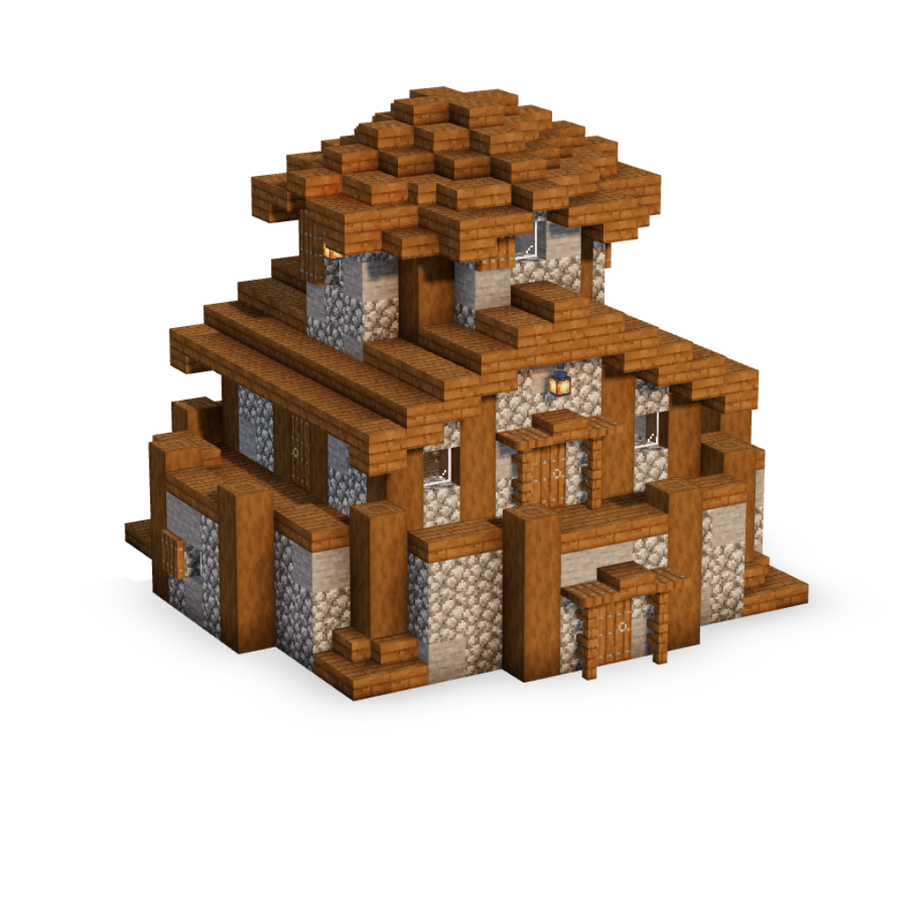
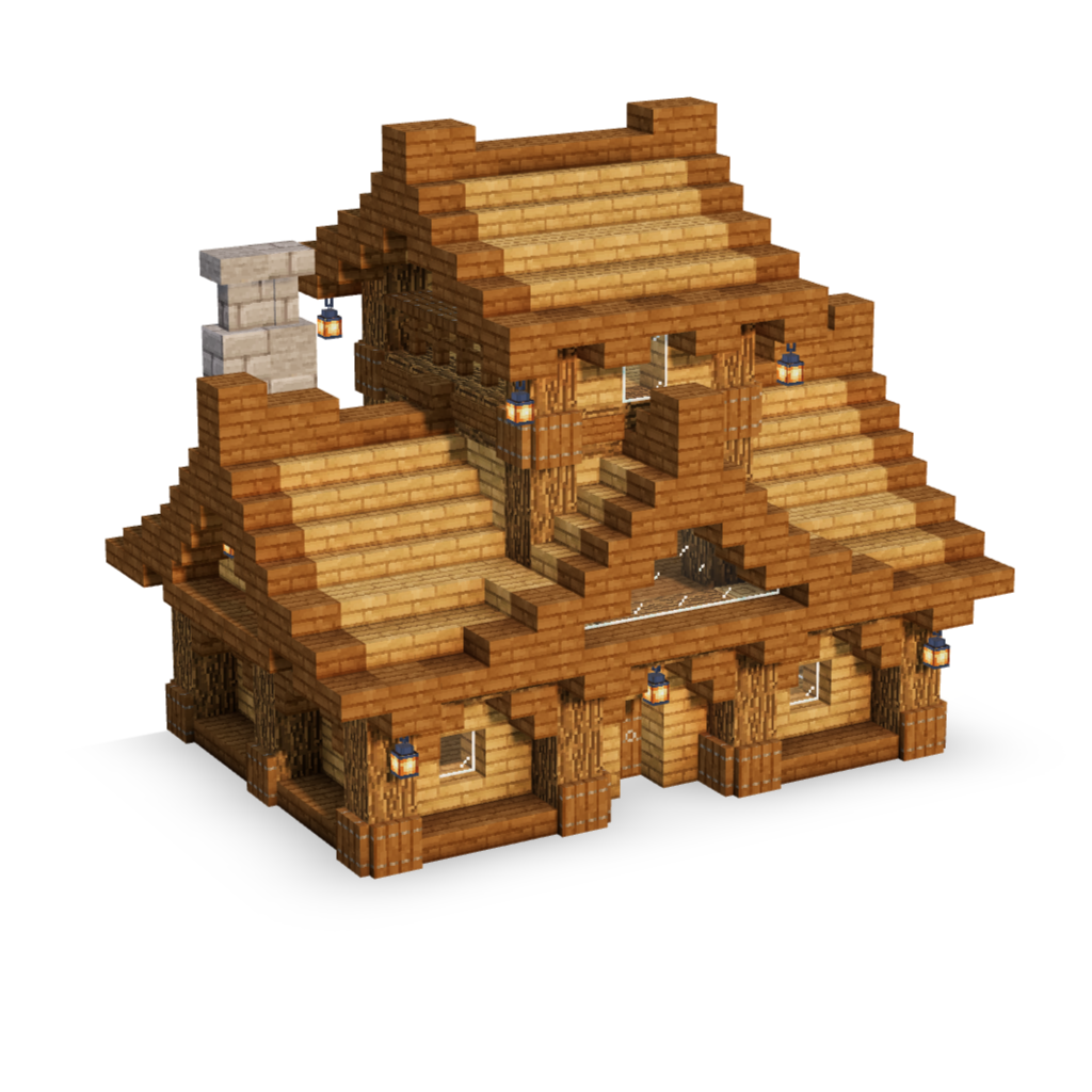
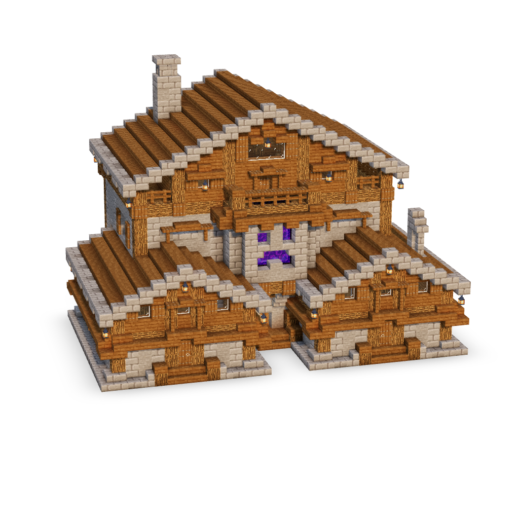
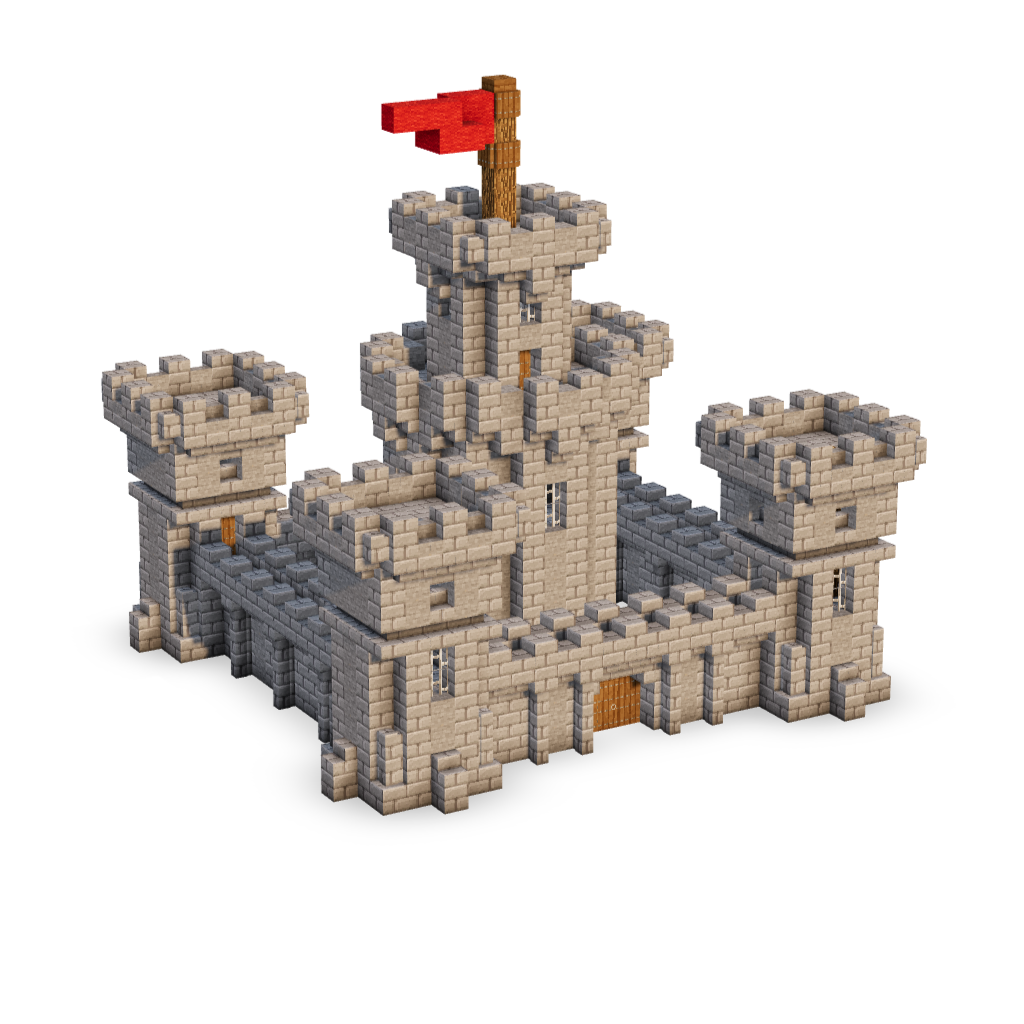
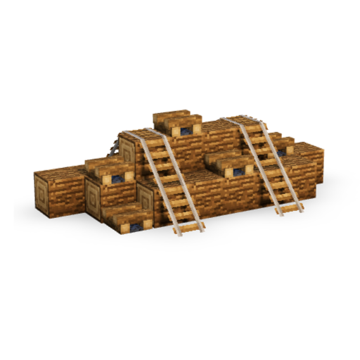
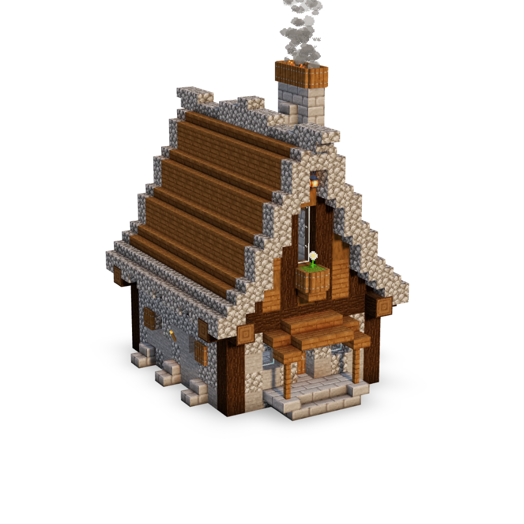
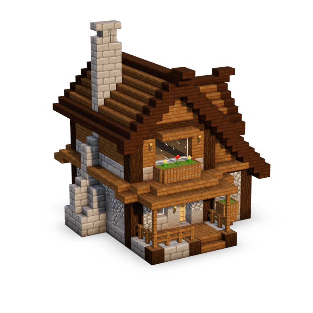
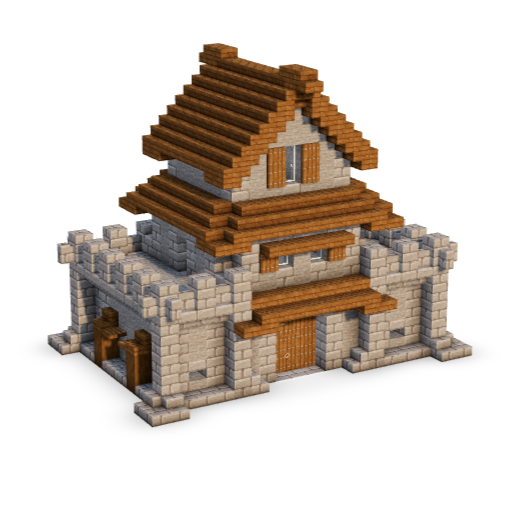
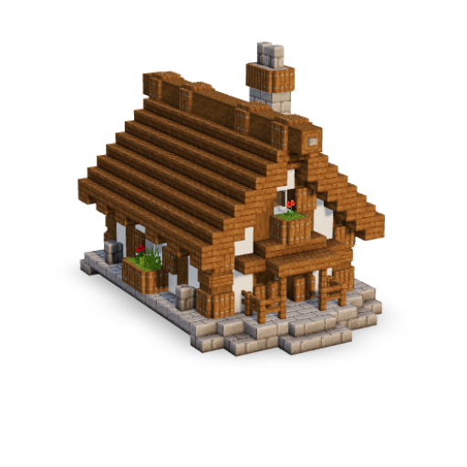
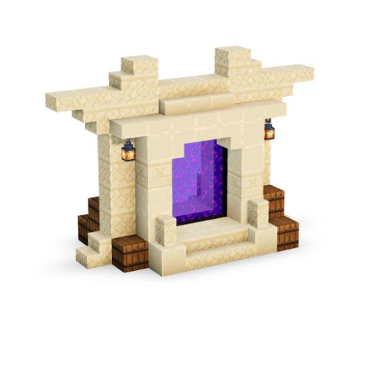
New features, improvements, and fixes — everything we ship lands here. When a step takes blocks away, like scaffolding coming down, they no longer shrink out of sight. They break the way they do in Minecraft: gone in an instant, with their own chips bursting out and their break sound. Ladders in the 3D viewer are no longer flat pictures on the wall. Each one has two rails and four rungs standing just off the wall, cut from the game's own ladder texture and one pixel deep. Doors are three pixels thick, the way they are in the game. When you step through a build in the 3D viewer, the soft shadows in the corners and under the blocks now arrive with each block as it lands. Before, they could show up ahead of the block that casts them, catch up a step late, or darken the whole build in one jump when the step finished. Now the build shades in as it goes up. The catalogue has a small gear at the end of its row of collection tags. Click it and a second row appears with search keywords taken from the builds themselves, most common first. More keywords opens the full list with a search box, so you can type a few letters and jump straight to the one you want. Pick a keyword and the catalogue shows every build that matches it. The gear remembers your choice on each device. The catalogue row on build pages could show the same build twice when that build comes in more than one look. Each build now appears once, in the look that fits best, which leaves room for more builds to pick from. On phones, touching anywhere outside the main menu closed it, and a small bump while scrolling was enough, so it kept disappearing mid-tap. It now stays open until you close it with its X or the menu button. A build going live, or a classic rebuilt for 2.0, now appears on this page within a minute instead of the next morning. Builds that land on the same day share one entry. Paint mode has a second setting: Delete block on click. Turn it on and every block you click in the 3D view is removed, no menu in between. Turn it off and clicks go back to swapping blocks. Undo works as usual, doors go as a pair, and a step left with nothing to place drops out of the timeline on its own. Pressing New style while one of the build's own styles is showing now gives you a copy of that style to make your own, with every block, colour and change carried over. The build's original styles stay as they are, so there is always a clean version to go back to. The same works on your own saved styles: New style branches a copy. PRO members can now keep the styles they make. Open a build, go to the EDIT tab, create your style and swap whatever blocks you like, then press Save style once. From then on it saves itself in the background as you work, so you can close the page, log out, or switch to another device and pick it up exactly where you left it. Your saved styles live on My Builds, in a new My styles section: one card per style, with a snapshot of your version of the build. Press Continue and the build opens already wearing your style. You can rename a style there, pick the block that stands for it as its icon, or delete it. Up to 12 styles per build. 6 of the original builds have been rebuilt for 2.0: full 3D viewer, step by step blocks and switchable styles. More speed work landed under the hood. Pages settle in faster when they open, and you will feel it most on a phone or a slower connection. Notifications sometimes showed a blank grey circle where the commenter's picture should be. Fixed: the bell now looks the picture up fresh every time, so it always matches what that member looks like right now, and it updates when they change it. Names in the comments are clickable now, everywhere: build pages, legacy pages, the updates page, all of it. Click a name and you land on that member's profile. Some of the oldest comments were written before accounts existed. Those names now lead to a proper "member not found" page instead of pretending to be a profile, so nothing dead-ends anymore. This page used to only cover changes to the site itself, so the actual builds going up were the one thing the changelog never mentioned. That is fixed, and the whole back catalogue since the 2.0 launch has been filled in below. Builds are grouped by the day they went live, with their pictures, so a day where nine went up reads as one entry rather than nine. Classics rebuilt for 2.0 get their own entry, because a build coming back with a 3D viewer is a different thing from one that never existed before. From now on it keeps itself up to date overnight. Everybody who has not uploaded a photo now has a proper profile picture instead of a blank grey circle. There are 111 hand drawn pixel characters: wolves, dragons, skulls and slimes, a beaver in a hard hat, a gargoyle, a very small computer. One is picked for you and it stays yours. Want a different one? Open your profile settings, click the camera button on your picture and take your pick. Uploading a photo of your own still works and still wins over any of these. Guests who comment get one too, so old comment threads are no longer a column of grey blanks. You can comment on any entry on this page, and until now a reply to one of those comments went nowhere: no bell, no count, nothing to tell you somebody had answered. Replies here now land in your notifications like replies anywhere else on the site. Tapping one brings you straight back to this page, opens the right entry, opens its comments and takes you to the exact reply. The other half of that: when a comment is deleted, the notification for it goes as well. Before, you could tap a bell and arrive at a comment that was not there any more. The emoji in the comments were whatever your phone or computer happened to draw, which meant the same comment looked different on every device and none of them looked like they belonged on a Minecraft site. There are now 64 hand drawn 16x16 pixel emoji, and they look identical everywhere: faces, hands, hearts, fire, a crown, a trophy, food and a row of animals. Old comments pick up the new art on their own, so there is nothing you need to do. Clicking an advert on a build page put the whole advert's text on the loading screen while the next page arrived, which looked broken. It now names the page you are actually heading to, the same way it does for every build and collection. On a build page, Trending this week and More builds from the collection were each picked without knowing what the other had chosen, so the same build could appear in both rows one above the other. Trending now takes first pick, and the collection row fills up from further down its own list. Same number of builds in each row, no repeats between them. Portals in the 3D viewer now cast real purple light onto the obsidian frame and the floor around them, instead of sitting there as a flat purple hole. The light also reaches further than it used to, so a portal lights its surroundings the way you would expect, and it stays lit whatever you have the Entity glow slider set to. If pages have been slow lately, or you were getting error screens, or a sign in refused to go through: that is fixed. Pages that used to take about four seconds now arrive in well under a second. The cause was the site doing far too much work behind the scenes on every single visit. A lot of that has been taken out, and the pages themselves are now served from a network of servers closer to you rather than being rebuilt from scratch every time. Signing in should be the biggest difference. Logins can never be served from that cache, so they were hit hardest, which is why some of you saw the verification step fail over and over. That should stop. One of the original builds has been rebuilt for 2.0: full 3D viewer, step by step blocks and switchable styles. A round of dark mode cleanups: some pages carried a big white panel behind their content, the notifications page kept a white box and a doubled title, and parts of the classics section on collection pages dressed in the wrong colours. All of it now follows your light or dark choice properly. One exception stays on purpose: classic builds have no dark art, so their section keeps its original light look, clearly framed, whatever your theme. Some collection pages were showing no classic builds at all, because the old site and the new one sometimes call the same thing by different names: Indoor versus Interior, Building Hacks versus Hacks, Nether Portals versus Portal. The matching now understands every one of those pairs, plurals included, so the classics section shows up wherever it should. Ironcrest Medieval Castle, one of the original classics, is the first legacy build fully rebuilt for 2.0: complete 3D viewer, step by step blocks, switchable styles and a proper introduction at the bottom of the page. Every classic build will make this trip over time. A converted build starts fresh: its counters reset and it wears the NEW tag, ranked like a brand-new release in Newest first. The homepage now opens with a big red card: Build It 2.0 is live. It carries a What's new fold with the highlights of everything that shipped this summer, and one button that drops you straight into the new Browse Builds. Browse Builds itself now wears a small EARLY ACCESS tag next to its title, because 2.0 is ready to use while we keep polishing it. The 2.0 header and footer are now everywhere: every build page, every collection, the classic pages, the homepage, all of it. One site, one look, top to bottom. Under the hood this also made the whole site lighter, because the old page builder no longer loads on every visit. Things simply arrive faster. 2 of the original builds have been rebuilt for 2.0: full 3D viewer, step by step blocks and switchable styles. On public profiles, pro members no longer carry a plain text tag next to their gold name. They get the crown: white on a small gold badge, the same crown the rest of the site uses. The Founder tag stays as it is. On phones, pressing and holding any thumbnail washed it in red. That was the browser's own tap highlight borrowing our brand colour, not a hover effect, which is why it survived every earlier fix. It is switched off at the source now, and taps feel clean. Logged-in members who tapped the logo, or typed the site address, were being bounced to their own profile page instead of the homepage. An old access rule was doing it. It is gone: the logo goes home now, for everyone. Build pages gained a new carousel: More Houses, More Statues, More Medieval, whatever collection the build you are on calls home. The builds that live on the same shelf, most loved first, one tap from the collection page itself. The page order got a cleanup with it: your Recently Viewed row now sits at the very bottom, and the catalogue carousel shows one big scene at a time on phones instead of three squeezed ones. The header now sticks on phones too, not just desktop, and it learned when not to: scroll down and it slides away to give the build the whole screen, scroll up even a little and it comes right back. Smaller touches in the same pass: the search opens instantly instead of thinking about it, the header greets you by your username, and on phones the menu now leads with your account, with notifications tucked into their own little section you can fold away. The account hub is a real home now. Your stats up top show when you joined, how many builds you have liked and how many comments you have posted. Below them: Liked Builds, My Comments, your Notifications, Profile, Billing and Help. And three new doors: Vote the Next Free Build takes you straight to the weekly vote, What's New drops you on the updates page, and Jump Back In remembers the last build you had open, picture and all, so one tap puts you back inside it. Two new choices we can make per build: skip the floor plan step entirely, so the guide opens right where the building starts, and let the ground grid grow with the build instead of outlining the whole finished footprint from step one. Most builds keep the classic opening. But for the ones where the plan step got in the way more than it helped, the guide now gets to the point. Stairs with a block right above them were coming out far too dark on their upper half, as if someone had scorched them. The shading math was piling every nearby block onto the same small face. They now shade like everything else: a soft touch of depth, not a burn mark. Campfires in the 3D viewer are now real light sources. A lit campfire warms the blocks around it, glows softly into the air, and its flames stay bright even when the fire sits deep in shadow under a roof. The smoke learned some manners too: it no longer drifts straight through the blocks above, it gathers under them and fades away, and the column is a little thinner so it decorates the build instead of hiding it. Every comment now carries three small dots in its corner. Behind them: Report, for anything that should not be there, Copy text, and Delete on your own comments. Reports come straight to us, so you never have to argue with anyone in a thread, just flag it and move on. Deleting a comment now removes the whole conversation under it too. The grey "Comment removed" rows are gone, including the old ones. And the comment box gained a little emoji picker, because some builds deserve more than words. 🔥 Every update on this page now has a vote and its own comment thread. If something we shipped made your day, or broke it, this is the place to say so: tap the arrows to weigh in, open the comments to talk. The old comment section that used to sit at the bottom of this page has been retired. Each update carries its own discussion now, right where it belongs. At the bottom of every build page there is now a proper introduction: what the build is, how big it stands, roughly how long it takes, every picture of it in one strip, a few voices from its comments, and a row of builds to try next. We are writing a personal note for each of the roughly 370 builds by hand, so these sections will keep getting better over the coming weeks. The From the catalogue row on build pages now chooses its scenes with intent: it favours looks related to the build you are on, never shows the same build in the same style twice, and mixes the lineup so a house page is not just ten more houses in a row. One more thing: when a scene shows a build wearing one of its other styles, clicking it opens the build with that style already applied, exactly what you saw in the photo. There is a bell in the header now. When somebody replies to one of your comments, it counts up in red, hovering it shows you the newest messages without leaving the page, and the new notifications page keeps the full history sorted by day. On phones, the menu carries the count and the latest few inside the drawer. It updates on its own while you browse. More kinds of notifications are coming as the community grows. The small confirmations that pop up at the bottom of the screen, saved a build, copied a link, that kind of thing, could appear behind the advert bar and go unread. They now ride above it, on every page, on every screen size. Build pages now carry a Fresh from the catalogue carousel under What to build next. It pulls the newest scenes from the community wall, restyles and looks you will not run into in the regular build rails, and each card takes you straight to the build in the photo. Every wall photo is a different shape, so each card shows a clean portrait crop aimed at the interesting part of the scene. A round of little fixes: the What to build next row could stretch past its own edges when flung, and on phones, touching a moving row made it jump to the middle of a build instead of stopping under your finger. Both behave now. The soft shadows under the cards in You recently viewed and Trending this week were being sliced off at the ends of the row in light mode, and so was the left arrow's shadow. Everything keeps its shadow. In the weekly vote, the Pro build cards were only something to vote on. Clicking the picture or the name now opens that build's page, so you can look a candidate over properly before deciding it deserves your vote. Click a build and its picture and name now appear on the loading screen immediately, stay there while the old page leaves, and are still there when the new page arrives. Before, the picture vanished into a plain square at the moment of the jump and flashed back a beat later, which read as a glitch. One build, one picture, held steady from the click until the 3D viewer takes over. The floating window you can pop out over Minecraft used to be a picture you could only watch. There is now a button in its top corner that wakes it up: drag to spin the build, right-drag to move it, scroll to zoom, exactly the same controls as the main viewer. It also gained a progress bar, the step count, and forward and back arrows, so you can walk the whole guide without ever leaving the window. The phone remote keeps working alongside all of it, and now steers from your pocket while the window sits on top of the game. In fullscreen on a phone, opening the build or style drawer hid its last few rows behind the timeline and the step controls. It looked as though part of the drawer had failed to load. It had not: it was underneath them. The drawer now stops above the controls, and it scrolls, so a long list of options can actually be reached instead of quietly running out of room. Some of the older build pages were printing raw shortcodes as visible text, things like [pvc_stats postid=""], left behind by plugins that were switched off months ago. They are gone, along with the empty gaps they were sitting in. Adverts no longer appear on Help, Contact, FAQ, How it works, Updates, your account and profile pages, the privacy policy, the terms, or anywhere in the signup and payment flow. Those are the pages you are on when something has gone wrong or when you are trying to pay, and an advert on them earns very little and gets in the way a great deal. The build guides themselves are unchanged. The adverts on Build It are now served by Journey rather than by Google. Nothing about how the site works has changed, and Pro is unaffected: members still see no adverts anywhere, which is the promise and always will be. The reason for the switch is simple. Journey pays considerably more for the same space, which means the site can keep every guide free for everybody without filling the page with more adverts than it has today. A build with three pictures of the original used to show all three before the first restyle appeared, so the wall gave you the same house over and over and the restyles were pushed to the bottom. Every style now keeps its own queue and the wall takes one from each in turn: a second picture of a style only comes round once every other style has had its turn. The original still leads its build, and which picture leads each style is drawn fresh each visit. The comment box now appears the moment you open a build instead of after the comments finish loading. On a build with nothing on it that used to mean seeing "No comments yet" and having no way to say anything. Builds that do have comments show placeholder rows while they arrive, and Post, Reply and Delete each show a spinner on the button while they work. If the comments genuinely fail to load it now says so and offers Try again, rather than quietly claiming the build has none. Every comment you wrote now has a Delete under it in the catalogue, next to Reply. It asks once before it does anything. If nobody replied to you the comment is gone. If somebody did, the row stays as "Comment removed" with your name and your words taken out of it, so the replies underneath still make sense instead of turning into stray remarks at the top of the thread. In My Builds the thumbnails of your liked builds were having their bottoms cut off on a phone, because the name row was taking a bite out of the square. The picture is a full square again. A build you have finished no longer sits in Continue building waiting to be continued: anything at 99 per cent or more drops off the list on its own. Every card there also has a trash can now, in the top corner, so you can clear a build out whenever you want. Liked builds now open three rows deep on a computer and five on a phone, with a Show more button for the rest, so everything underneath is reachable again. Continue building swipes sideways on a phone and holds your eight most recent builds: starting a ninth drops the oldest off the list, and your place in it is still saved. On a wide window the More button sits far to the right, and its menu opened off the edge of the page. It now slides back inside whichever edge it runs into. Collection filters that end in Biome now drop it, the way Style and Collection already did. Forest Biome reads as Forest, Mesa Biome as Mesa. The Build it button in the picture panel was stopping short of the right edge, leaving a gap down one side of it. It now fills the panel properly. The like tally no longer sits on top of the artwork in the catalogue. The heart still tells you whether you liked a build, and the number lives on the build's own page. On a phone the cards are now just the picture and the heart in the corner, with the name and its dark fade gone from over the image in both layouts. The heart and the play mark have also lost the grey discs they used to sit on, so only the shapes show over the artwork. The name still leads the panel the moment you open a picture. A Pro build wears the same red badge here that it wears in My Builds. Opening a picture in the catalogue now tells you what the build costs, right beside its name: a green FREE or a red PRO. The build the community voted open for the week wears two: its PRO tag turns green, and a second tag beside it counts down how long you have left to build it for nothing. The catalogue was reading the old 1.0 access list instead of the current one, so every Pro build in it looked free and none of them wore the crown. They are marked correctly again. Sorting the catalogue by Most liked opened on the wrong build: the most liked scene sat eleven cards down the page, and Name A to Z only turned alphabetical at the eleventh card. Every sort in the catalogue now puts the right build first. In the catalogue, liking a build could flash plus one and then settle one BELOW where it started, and unliking did the reverse. It hit any build you had already liked somewhere else, which is why most of them misbehaved and a few seemed fine. Liking one style still lights that style only, and each style you like still adds to the build's total. The catalogue now opens on Featured, which ranks builds on how much they are viewed and how much they are liked together, rather than on either one alone. It also spreads a build's pictures out across the wall. The original always leads, and the restyles of it are pushed as far down as they can go, so you are not looking at the same house three times in a row. Which shot of a style gets the good spot is drawn fresh each visit. If a build failed to load, the loading screen sat there for a long time before giving way, with nothing to show at the end of it. It now gives way straight away. In dark mode, opening some pages threw a full white screen up in the middle of the move and then went back to dark, while others did not. The loading screen now follows your choice of dark or light on every page, so the colour never changes while you are moving around. Moving around the site now shows a proper loading screen the moment you click, in the site's own light or dark colours instead of a flash of white. On a build page it shows that build's picture and name, and it waits for the 3D build itself, so you no longer land on an empty stage while everything is still arriving. Opening a build could flash through a few frames of the wrong thing before the viewer settled. It now appears once, finished. Some visits were loading to a completely blank screen that only came back after a refresh, and it could happen on any page. That is fixed. It sorts itself out on your next visit, so there is nothing you need to do. On steps that place a lot of blocks at once, the shading between neighbouring blocks could arrive all at once at the end of the animation. It now eases in instead of appearing in one jump. While a step is being placed, blocks falling side by side used to each drop their own round shadow, so a row of blocks read as a line of separate dots. Blocks landing at the same height now share a single shadow, so it looks like one object coming down instead of several. On phones, the shadow under a build was drawing as hard grey squares instead of a soft shadow, and it looked especially wrong in light mode. Phones and computers now draw it the same way, so every build sits on a clean soft shadow wherever you are looking at it. Small blocks like buttons, signs and torches also stop casting a full block of shadow on the ground below them. Block placing sounds were silent on iPhone and on some Android phones. They now play as soon as you interact with the viewer, on both. One thing worth knowing on iPhone: the side switch that silences your ringer also silences websites, so if the viewer is still quiet, check that switch first. The 3D build viewer now opens fullscreen on phones and tablets, not just on computers. Tap the fullscreen button above the viewer and the build fills your whole screen, with the step controls, the slider and the build menu all where you expect them. Closing it puts you back exactly where you were on the page, so you never lose your place in a tutorial. Fresh builds now wear a blue NEW tag everywhere on the site. Green now means exactly one thing: free. One glance, no mixups. The FREE badge on the weekly free PRO build now shows the time left, like FREE · 2d 4h left, so you always know how long you have before the next build takes its place. Want a say in what goes free next? Cast your vote on the vote page. The legacy area on collection pages slimmed down: every tag is a pill with its build count, cards show just the name and likes on one line, and on phones the carousel became a simple grid with a Load more button and its own filters. Hand-picked builds now open every collection with big cinematic cards: the build name in large type, a short tagline, and a quick like button right on the card. Browse them with the arrows or grab and throw the row with your mouse, it even bounces at the ends. The most liked featured build always leads. Collection pages now use the same mobile system as Browse Builds: search up top, the collection tags right under it, a wide sort bar, and a gear menu holding the thumbnail style, builds per row and card info options. Cards render exactly like they do on desktop, and you pick one or two per row. The weekly free build is live. Every week, one full PRO build unlocks for everyone: every step, every angle, completely free until Monday. This week it's Aldercrest House, wearing the green FREE badge across the site with a live countdown of the time left. When the week flips, the community's most voted build takes its place, so cast your vote and decide what goes free next. Featured images gently zoom while you hover them. Dark mode visitors get a friendly note that the legacy section keeps its original light look. And when you reach the end of a collection's 2.0 builds, a short message reminds you that new ones land all the time. The build suggestions under every build lost their badges: just clean cutouts with a crown where it counts, red for PRO and green for the week's free build. The free build's card in the rails also wears its full green treatment now. In one-per-row view on Browse Builds and collection pages, the like button grew into a proper thumb target: bigger heart, bigger count, easier to hit. Cards on collection pages now show the build's main collection next to its difficulty, just like on Browse Builds. Dark mode got its text fade back on scene thumbnails, cutout cards stand tall the way they do on Browse, and the sort menu was trimmed to the options that matter. Some builds on Build It are now credited to Build It Labs, our in-house workshop. The page explains how those builds are designed, tested and verified before they reach the site. New default profile pictures and banners, made for Build It. Every account without a photo automatically gets one, and you can pick your favorite from the pack on your own profile. Upload your own any time and it always wins. Every week one PRO build goes free for everyone, and the community picks it. Head to the vote page, pick your favorite, and the winner unlocks automatically on Monday. One vote per member, and you can change it any time before the week flips. The block swap menu now shows the block name with the step it was placed in, and it stays open while you rotate the build. Editing styles also got proper Undo and Redo buttons, and they only affect the style you are working on. Free visitors can now open the block swap menu on any build and browse every block a style uses, right from the build or the style panel. Swapping blocks and saving your own styles stays a PRO perk, but now you can see exactly what you would be getting. The 3D viewer got a deep performance overhaul for large builds. Stepping through a several-thousand-block build is now up to 10x faster, big jumps land almost instantly while the rest streams in, memory use is roughly half of what it was, and the frame rate no longer drops the longer you build. Sound effects also keep working through huge steps instead of cutting out. Build pages now follow your light or dark choice properly across the whole page. Light mode also got a cleaner 3D view (no darkened corners unless you want them back, the switch is in Advanced) and softer, uncut shadows everywhere. The thumbnail choice in the header gear (scene photos or cutout renders) now applies to all the build rows on build pages too, and switches live. Cutouts render whole on a clean card, no cropping, no clutter behind them. The sections under each build got rebuilt from scratch. What to build next suggests builds that genuinely fit the one you are on, shown as clean cutout thumbnails. Below it: every collection at a glance, Trending this week powered by real views, and the builds you recently opened. Every card now shows the build's collection, a working like button, and a crown on member builds. A bot attack on our signup page triggered heavy automatic protections, and for about a day some purchases and registrations did not go through. It is fully fixed: if you paid during that window, your PRO access has been activated automatically. Sorry for the trouble, and thanks for your patience. Anywhere you see a comment, on build pages, in the catalogue, or on profiles, you can now click the commenter's name or picture to visit their profile. PRO members and the Founder also got a subtle glow on their avatar rings. Looks sharp. Comments on profile posts are now full threads, just like on build pages: upvote and downvote, reply to each other, and the best comments rise to the top. You can also delete your own posts and comments any time, with a clean confirmation, and none of it reloads the page. Votes count instantly, buttons show a little spinner while they work, and if something goes wrong you get a clear message instead of a frozen page. Posting, replying and deleting all happen without reloading the page. The tag row under the search bar now covers every collection: types, styles and biomes, each with its build count, and the ones that don't fit tuck into a More menu. The sidebar filters got smarter too: they only offer options that actually lead to builds with your current selection. Right under the build name you now see the total views, the publish date and who created the build, with their picture and a link to their profile. The download button also says what it does on desktop now. You can now create posts on your own profile: write with bold, italics, lists and links, and attach up to 4 images. Click any image to view it fullscreen. Each post has its own comment thread with upvotes and replies, just like on build pages, and you can delete your own posts and comments any time. Every member now has a public profile page: banner, profile picture, bio, social links and a feed of their activity. Commenter names and pictures across the whole site link straight to their profile. Founders wear red and PRO members wear gold, with a matching glow on their profile picture. The footer wears the new logo, and our social links for YouTube, TikTok and Instagram now live right under the newsletter signup. Come say hi. The header grew up: Click the search icon and a full search popup opens: instant results as you type, thumbnails for every build, legacy builds included, collections with their icons, plus popular and recent searches when you're deciding what to look for. Enter takes you to the full results page. We spent a night deep in the engine room. After a rough patch, pages now load dramatically faster across the whole site, and we fixed the root causes instead of just the symptoms. Collection pages now match the rest of Build It 2.0: cleaner filters and tag pills, a tidier layout, and a sliding carousel for the legacy builds section. Flip through pages of classic builds without endless scrolling. 13 new builds are ready to follow in 3D. And 7 more. 10 new builds are ready to follow in 3D. And 4 more. 3 new builds are ready to follow in 3D. 12 new builds are ready to follow in 3D. And 6 more. Glass now renders the way Minecraft does it, so you see straight through a block instead of its back face. Builds also sit in a light scenery of grass, flowers and hills that you can toggle off any time. 9 new builds are ready to follow in 3D. And 3 more. The Edit tab is now the Style tab, and it got serious upgrades: The FAQ has been rebuilt for the new site, and you can now send us a question directly from the FAQ or Contact page — answers land in your email inbox. Going Pro is now a lot clearer: a redesigned checkout that shows exactly what you get, whether your plan is recurring or one-time, and secure payment through Stripe or PayPal. We opened the Catalogue: a feed of scenes from our builds that you can scroll for inspiration. See something you love? Hit "Build info" to see its style, biome, and difficulty — then jump straight into the tutorial and build it yourself. Everyone on Build It now has a public profile — your photo, banner, bio, social links, and your activity on the site. Make it yours from your account page, then share it. Your account got a full makeover. From your account page you can now: Edit your profile, photo, and banner in one place Build It just got its biggest upgrade ever. A brand-new look, a faster site, and a whole new account experience — this is the foundation for everything we're building next (including some things we're very excited about, like the interactive 3D viewer and custom style presets). Everything you know is still here: every build, every tutorial, your account, and your saved builds. It just looks and works a lot better. Found something broken? Tell us through the contact form — it goes straight to us.
What's new on Build It
Blocks break like in the game
Ladders and doors in real 3D
Shadows land with the blocks
Search keywords in the catalogue
Every build shows up once in What to build next
The phone menu stays open while you use it
New builds show up here right away
Delete blocks with a click
New style starts from the style you’re on
Save your style
6 classics rebuilt in 2.0
Pages open quicker
The bell shows the right faces
Every commenter is one click away
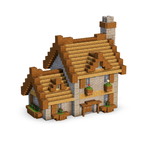
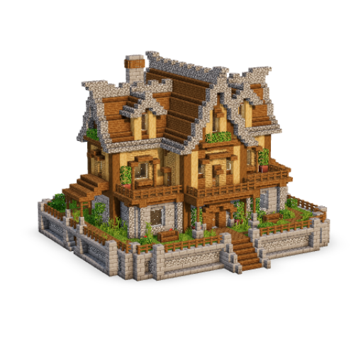
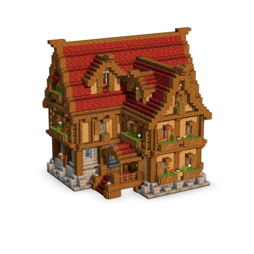
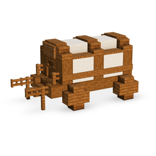
Every new build now shows up here
111 profile pictures to choose from
Replies on this page reach your bell
The emoji are pixel art now
The loading screen knows where you are going
No more seeing the same build twice
Nether portals finally glow
The site is quick again
A classic rebuilt in 2.0
Dark mode stopped leaking white
Collection pages found their missing classics
The first classic build reborn in 2.0
Build It 2.0, announced where everyone can see it
The new look now runs the whole site
2 classics rebuilt in 2.0
Pro members wear the crown on their profile
No more red flash when you hold a thumbnail
Members reach the homepage again
Every build now shows off its collection
The header got smarter about staying out of your way
Your account page grew up
Some builds now open straight onto the first blocks
Stairs stopped standing in their own shadow
Campfires burn like they mean it
Comments grew a quiet menu, a Report button and an emoji box
This page just became a conversation
Build pages now introduce their builds
The catalogue carousel got pickier
Build It taps you on the shoulder now
Little messages stopped hiding behind the advert bar
The catalogue comes to every build page
Small rough edges smoothed on the home and build pages
Vote cards now take you to the build
The loading screen keeps your build in view between pages
The floating guide window is now a little viewer of its own
The build and style drawer no longer cuts off on phones
Stray code no longer shows up in the older guides
No more adverts on the pages you go to for help
Build It has changed ad partners
Featured alternates a build’s styles instead of stacking them
Comments open instantly and show what they are doing
You can delete your own comments
Liked builds no longer cropped on phones
Finished builds leave Continue building
My Builds opens shorter
The More filter menu stays on screen
Collection names read cleaner
The Build it button fills the panel
Cleaner catalogue thumbnails
FREE and PRO now show when you open a build
Pro builds were showing as free in the catalogue
Most liked now really is most liked
Liking a build no longer takes a like away
Featured is the new default view of the catalogue
A build that cannot load no longer leaves you waiting
No more white flash in dark mode
New loading screen
No more flicker while a build opens
Blank pages fixed
Shading settles more smoothly on big steps
Falling blocks cast one shadow together
Build shadows look right on phones
Sound now works in the 3D viewer on phones
Fullscreen 3D viewer on phones and tablets
The NEW tag turned blue
See how long a build stays free
A tidier legacy section
Featured builds get the spotlight
Collection pages, rebuilt for your phone
One PRO build is now FREE every week
Small touches around the site
What to build next, decluttered
Easier taps on your phone
Collection cards catch up to Browse
Meet Build It Labs
Fresh looks for every profile
Vote for next week’s free build
A better swap menu, plus Undo and Redo
Peek inside every style
Big builds, way smoother
Light mode, polished
Your thumbnail style, everywhere
A smarter end to every build page
Signups and payments hiccup, fixed
Meet your fellow builders
Real comment threads on profiles
Snappier comments everywhere
Smarter tags and filters on Browse Builds
Build pages show views, date and creator
Post on your profile
Member profiles are live
Footer refresh
New header: mega menu, settings and a fresh logo
Brand-new search
A faster Build It
Collection pages got a big refresh
13 new builds are up
10 new builds are up
3 new builds are up
12 new builds are up
Clearer glass and prettier scenery
9 new builds are up
Style editor: paint mode, biomes and banners
New features and polish for the 3D viewer
New FAQ and contact form
A smoother, clearer checkout
The Catalogue — endless build inspiration
Public builder profiles
A brand-new account section
Add your social links (YouTube, Twitch, TikTok, and more) to your public profile
See and manage your saved builds
Manage your membership and billing — plan, payment history, and cancellation, all on one pageWelcome to the new Build It
0
0
0
0
0
0
1
1
1
1
1
1
1
1
1
1
1
1
1
1
1
1
1
2
2
2
2
1
1
2
1
2
2
2
2
1
1
2
2
2
2
2
2
1
2
2
1
1
1
1
1
1
1
1
1
1
1
1
1
1
1
1
1
1
1
1
1
1
1
0
0
0
0
0
0
0
0
0
0
0
0
0
0
0
0
0
0
0
0
0
0
0
0
0
0
0
0
0
0
0
0
0
0
0
0
0
0
0
0
0
0
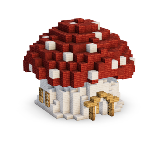
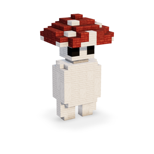
0
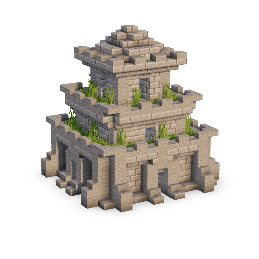
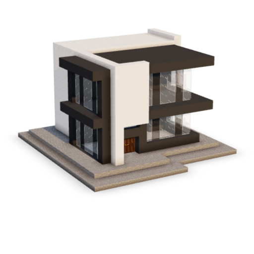
0
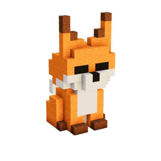
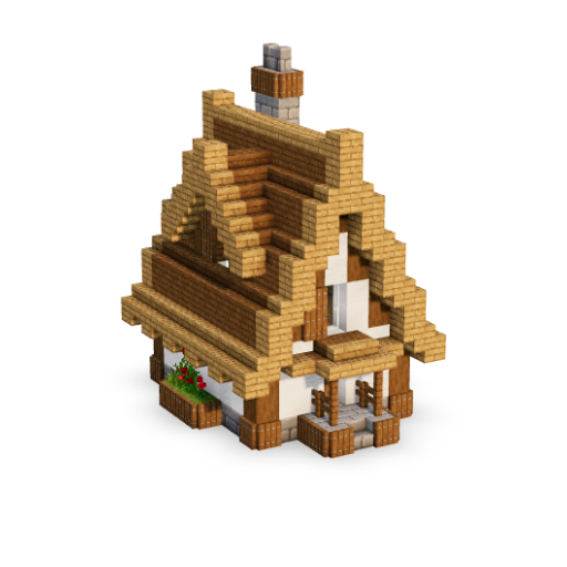
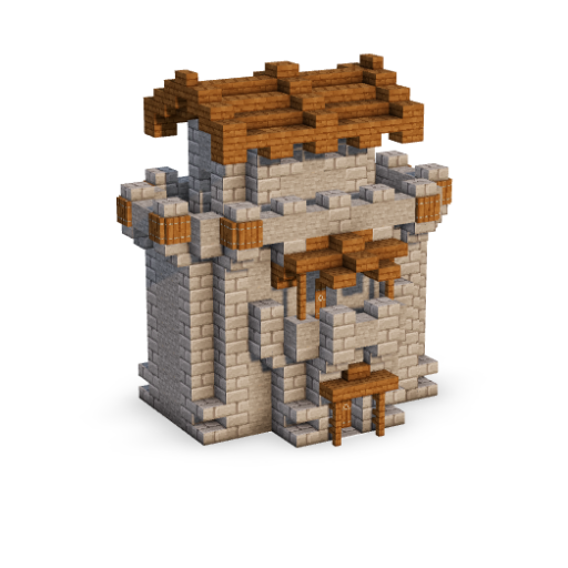
0
0
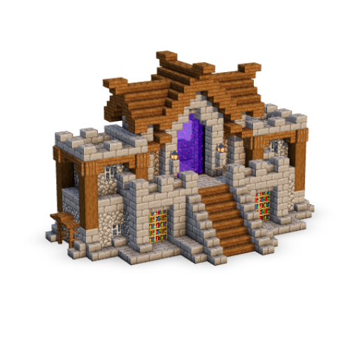
0
0
0
0
0
0
0
0
0
muy buena app, la uso seguido. 👍🦍
is there any new update ? I would like to see new ones like redstone ideas
When is there going to be a update on builds
Probably never, even in the discord the creator’s been radio silent for a year +
Its not letting me cancel my membership lol – hes stolen like £40 off me
How can we contact the person? It seems like an abandoned site. No updates since 2022.
cant find the advent calendar, help
I cant even login and when I try to email them it says I can’t because I’m likely sending spam.
It won’t let me log in to view the membership pages.
why last update 2022 😭😭😭?